If you want to increase the number of leads generated by your landing pages, the short answer is to concentrate on having a strong call to action (CTA), clarity, & relevance. Making it extremely simple for visitors to comprehend what you’re offering and what you need them to do next is crucial. Consider your landing page as a targeted dialogue rather than a disorganized billboard. Every component should direct your visitor toward that one, clear objective.
It takes more than just aesthetics to create a professional landing page. It is a tactical tool designed to turn website visitors into leads. It stands out from your primary website due to its singular focus, lack of navigation menus, and lack of distractions. Every component, including the button color and headline, is tailored to a single action. What Distinguishes It?
In the realm of digital marketing, having a well-designed landing page is crucial for generating leads. For those looking to enhance their online presence, you might find it beneficial to explore the article on affordable shared hosting plans for small businesses. This resource can provide valuable insights into selecting the right hosting solutions that complement your professional landing page design. To read more, visit this article.
A landing page is a guided tour to a particular location, in contrast to your homepage, which may encourage exploration. Let’s say you have a free ebook available. There would be no links to your blog or service page on the landing page for that ebook. It would be fully devoted to outlining the purpose of the ebook and the reasons it should be downloaded. This concentrated experience lessens cognitive load & prevents guests from becoming distracted.
The equation for conversion. The fundamental formula for a successful landing page is Value Proposition + Ease of Action = Conversion. Whether it’s completing a form, making a purchase, or subscribing to a newsletter, you must first clearly explain the benefit to the visitor and then make it simple for them to complete the desired action.
Check out our amazing website services at website services.
Your lead generation efforts will inevitably improve when these two factors coincide. It’s about maximizing incentive and minimizing friction. You must have a thorough understanding of two things before you even consider design: the target audience and the desired outcome.
Creating a professional landing page design is essential for generating more leads, and understanding the broader context of website design can significantly enhance your approach. For instance, exploring the principles of effective website design can provide valuable insights into how to optimize your landing pages. You can find more information on this topic in the article about website design in Malaysia, which discusses various strategies that can help improve user engagement and conversion rates.
It’s like trying to bake a cake without knowing who will be eating it or what kind of cake they prefer if you skip this step. Who Do You Speak With? There is more to this than just demographics. The subject is psychographics. A 25-year-old entrepreneur seeking a marketing course has very different concerns than a 40-year-old CFO seeking B2B accounting software.
What are their goals, what are their problems, and what are their pain points? Their unique needs and motivations must be directly addressed on your landing page. Pain Points: What causes them to stay up late? How does your offer help?
Aspirations: What do they want to accomplish, and how can your offer help them get there? Objections: What worries might they have about your business or your offer? How can you proactively address these? You can create messaging that connects on a deeper level than standard marketing jargon by getting these details down pat.
What is it that you would like them to do? Every effective landing page has one call to action (CTA) that is very clear. Be brutal here if you want to download an ebook, schedule a demo, ask for a consultation, or purchase a product. Avoid giving too many options or attempting to add secondary CTAs.
When visitors are presented with too many options, they frequently select none. Clarity of Purpose: This one action should be the focus of the entire page. Measurable Objective: In order to monitor your conversion rates, this particular action should be quantifiable. You can start creating a landing page that really fulfills its purpose once you have a solid understanding of your target audience and your specific objective.
Although this fundamental work is frequently disregarded, it is essential for producing real leads rather than just page views. Your landing page copy is more than just text; it serves as a guide, a sales pitch, & a value proposition. It must be compelling, simple to understand, and specifically tailored to your visitors’ needs. Strong headlines have power.
People see your headline first, & it frequently decides whether or not they will continue reading. It must attract attention, make your offer’s advantages clear, and, ideally, arouse curiosity or a sense of urgency. Benefit-Oriented: Pay attention to what visitors gain rather than just what you have to offer. Try “Boost Your Sales by 30% with Our AI-Powered Software” in place of “Our New Software.”. A “.
Clear & Concise: Get right to the point. People scan. Relevant to the Ad/Source: If they clicked on an advertisement, make sure the headline instantly fulfills its promise.
Here, consistency is essential. A strong headline invites readers right in, while a weak one is like a closed door. Put a lot of effort into refining your headline.
Subheadings and Body Copy: Maintaining Punch. Your body copy and subheadings must fulfill the promise made in the headline without overpowering the reader. Divide lengthy text passages into manageable portions. Subheadings as Signposts: As mini-headlines for each section, use subheadings to direct the reader through the features and advantages. Lists and bullet points are your closest allies. They greatly facilitate the scanning and digestion of information.
Use bulleted lists to highlight important features and advantages. Prioritize Benefits Over Features: Although features are crucial, consumers purchase solutions to issues. Describe how your features provide the user with advantages. “Never worry about running out of space for your crucial files again” is a benefit, while “unlimited storage” is a feature. Use active voice; it’s more direct and captivating.
Proactively Address Objections: If there are common issues (e.g. (g). subtly address them in your copy (cost, complexity, time commitment, etc.). Recall that landing pages are scanned rather than read. Prioritize scanning over in-depth reading when creating your copy.
The Crucial Call to Action (CTA). The grand finale is your CTA button. It must be impossible to miss and fully clear about what will happen when you click on it. Action-Oriented Language: Make use of powerful verbs like “Download,” “Get,” “Start,” and “Claim.”. Try “Start My Free Trial” or “Get My Free Guide” instead of “Submit.”. The “.
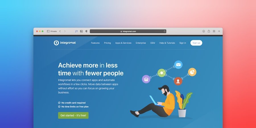
Make it visually striking by placing it prominently. Put it above the fold, use a contrasting color, leave enough white space around it, and possibly repeat it below. Single, Clear CTA: One primary action, as previously indicated. Keep your visitors from being confused. Reassurance (Optional but beneficial): Occasionally, a brief statement like “No credit card required” or “We respect your privacy” next to the call to action can ease tension.
The crucial point is the CTA. The call to action should seem like the obvious next step if your copy has done its job. Beyond words, your landing page’s visual elements are crucial for establishing credibility, projecting professionalism, and directing visitors to take the desired action. Consider design to be the silent salesman.
Structure and Layout: Information Flow. Even for someone who is just skimming, a well-organized layout offers clarity and makes your page simple to navigate. The visitor’s eye should be drawn down the page by its intuitive feel. Above the Fold: This is the best property.
You should be able to see your main headline, subheadline, and call to action (CTA) without having to scroll. This expresses your offer right away and establishes expectations. Logical Hierarchy: Information should be arranged logically, usually from general (problem/solution) to specific (benefits/features) to action (CTA). Lots of White Space: Avoid packing too much information into a small space. White space makes important elements stand out, decreases visual clutter, & enhances readability. It provides the eye with a resting place.
Mobile responsiveness is now mandatory. Mobile devices will probably account for a large amount of your traffic. Every screen size must have a flawless landing page. Do a thorough test! A disorganized layout is confusing and will quickly drive visitors away.
Focus is maintained with a neat, well-organized structure. Visuals and Video: Don’t Just Tell, Show. Compared to text alone, visuals can convey complex ideas much more quickly and effectively. Credibility and personality are also added. High-quality and Relevant: Make use of expertly taken, high-resolution pictures or videos that are specifically related to your offer.
If at all possible, stay away from generic stock photos. Display your team, your product, or the outcomes your clients attain. Hero Image/Video: Your message can be quickly communicated or an emotion evoked by placing a large, captivating image or brief video near the top of the page.
Icons and illustrations can enhance the page’s visual appeal, highlight key elements, and break up text. Make sure your brand is consistent with them. No Distracting Elements: Steer clear of animated GIFs, carousels, and autoplay videos unless they are absolutely necessary for the offer. These elements could detract from your main point or cause your page to load more slowly.
The wrong picture can totally ruin your message, but the right one can take the place of a hundred words. Branding consistency and color psychology. Colors can affect perception and elicit feelings.
Your branding elements – colors, fonts, logos – should be consistent across your landing page, your ads, and your main website. Brand Alignment: Your landing page ought to seem like a continuation of your brand. Make use of the logo, typeface, and color scheme of your company. This increases familiarity & trust. CTA Color: Use a color that contrasts with the rest of the page to make your CTA button stand out.
It should attract attention, but it shouldn’t conflict with your brand. Restricted Color Scheme: Avoid using too many hues. To keep your brand looking polished and unified, stick to the primary and accent colors. Readability: To make your text easy to read, make sure it contrasts enough with the color of your background. Consistency fosters trust.
A sense of disconnection & mistrust may result if your landing page appears entirely different from the advertisement that brought them there. In the crowded digital world of today, trust is critical. Visitors are cautious about overselling & scams. To increase conversions, your landing page must actively establish credibility.
The power of other people’s experiences is known as social proof. People are inherently impacted by what other people say & do. Conversion rates can be greatly raised by using social proof. Testimonials: Brief, genuine testimonials from pleased clients that include names, images, and, if feasible, the company.
Put them strategically, maybe close to the CTA or the advantages. Pay attention to testimonials that address common concerns or emphasize particular advantages. Case Studies: Linking to a complete case study can offer more thorough validation if your offer is intricate or valuable. Trust Badges and Logos: Showing industry honors, security badges (e.g.), and the logos of businesses you’ve collaborated with.
A g. Credibility can be immediately increased through SSL certificates, payment processors, or media mentions. Subscriber/Customer Count: Saying “Join 10,000 satisfied customers” can be convincing if you have a lot of users or subscribers.
Star Ratings: Show the average star ratings for your goods or services, if applicable. The key here is authenticity. False testimonies are more detrimental than beneficial. Resolving Issues: FAQs and Promises. Anticipate queries and issues from visitors and directly address them on the page.
This proactive strategy boosts self-assurance. Concise FAQ Section: A succinct, well-structured FAQ section can address frequently asked questions without requiring users to navigate away from the page in order to find the answers. Concentrate your inquiries on possible deal-breakers. Clearly Stated Guarantee or Refund Policy: Providing a money-back or satisfaction guarantee can greatly lower perceived risk and eliminate a significant conversion barrier.
Indicate the terms clearly. Privacy Policy Link: Include a link to your privacy policy at all times, even if it’s not always obvious. This is especially important if you’re gathering personal data. This exhibits openness. You demonstrate your support for your offer & concern for your clients by candidly addressing any potential reservations. If a landing page is slow, broken, or not visible to search engines, it won’t convert, no matter how lovely and well-written it is.
Performance is largely dependent on technical factors. The speed at which a page loads is crucial. Our world is one of instant gratification. Before they even see your offer, visitors will abandon a page that loads slowly. Optimize Images: Reduce image size without compromising quality.
Make use of the proper formats (PNG for transparent graphics, JPG for photos). Minify Code: By eliminating extraneous characters, you can make your HTML, CSS, and JavaScript files smaller. Make Use of Browser Caching: Let browsers cache portions of your page so that it loads more quickly on subsequent visits.
Select a Quick Hosting Provider: Speed is greatly impacted by your hosting environment. Avoid Using Too Many Plugins and Scripts: Every extra script (such as social widgets or trackers) increases load time. Include only what is necessary. Use tools like GTmetrix or Google PageSpeed Insights to test the speed of your pages, and strive for a load time of less than two to three seconds. Fundamentals of Search Engine Optimization (SEO). Although sponsored traffic frequently drives landing pages, organic search optimization can offer a useful supplementary source of traffic.
Relevant Keywords: Make sure your headline, subheadings, & body copy all contain your main target keywords (not keyword stuffing, of course). Create captivating, keyword-rich meta titles & descriptions to persuade readers to click through from search results. Image Alt Text: Give your images a meaningful alt text description. This increases accessibility and aids search engines in comprehending the content of your images. Clean URLs: Make use of succinct, informative URLs that contain your main keyword.
A small amount of SEO work for landing pages can eventually pay off, even if paid advertisements are your primary channel. Analytics setup and security. For a professional landing page, these are essential. SSL Certificate (HTTPS): Crucial for trust and security. Users are alerted by browsers about unsafe websites.
Google also favors HTTPS. Google Analytics: Essential for monitoring visitor behavior, determining their origins, and pinpointing areas in need of development. Establish objectives to precisely monitor conversions.
Conversion tracking: Make sure you have conversion tracking pixels (e.g.) if you’re running paid ads. (g). Facebook Pixel, Google Ads conversion tracking) properly set up to gauge the success of your campaigns and maximize your ad budget. Form Optimization: The Key to Success. A visitor becomes a lead in the form, which is where the magic happens.
Your conversion rate could be killed by any friction in this area. Minimal Fields: Only request the information that is absolutely necessary. Each additional field lowers completion rates. Is their fax number really necessary?
Clear Labels and Placeholders: Make sure that each field’s contents are clear. Inline Validation: If a user enters incorrect data, give them immediate feedback (e.g. The g. an email that is not properly formatted).
This keeps things from getting frustrating. Single-Column Layout: Single-column forms are simpler to scan and fill out, particularly on mobile devices. Captchas (Use Caution): Captchas increase friction even though they are occasionally required to stop spam. If at all possible, use a reCAPTCHA or an alternative that doesn’t require difficult puzzles. Progress Indicators: In multi-step forms, a progress bar indicates the amount of work left to complete, which lowers abandonment.
Keep in mind that the form should be as frictionless as possible. You will lose potential leads for every obstacle you put in your way. Your expert landing page will not only look great but also function incredibly well if you pay attention to these technical and user experience details.
.
FAQs
What is a professional landing page design?
A professional landing page design is a web page specifically created to capture a visitor’s attention and encourage them to take a specific action, such as signing up for a newsletter, downloading a resource, or making a purchase. It is designed to be visually appealing, easy to navigate, and focused on a single call to action.
How can a professional landing page design generate more leads?
A professional landing page design can generate more leads by effectively communicating the value proposition of a product or service, using compelling visuals and persuasive copywriting, and minimizing distractions that could lead visitors away from the desired action. It can also incorporate lead capture forms and other conversion-focused elements to encourage visitors to provide their contact information.
What are some key elements of a successful professional landing page design?
Key elements of a successful professional landing page design include a clear and compelling headline, engaging visuals, concise and persuasive copy, a prominent call to action, social proof or testimonials, and a streamlined and intuitive user experience. It should also be optimized for mobile devices and load quickly to maximize conversions.
How can A/B testing be used to improve a professional landing page design?
A/B testing, also known as split testing, can be used to improve a professional landing page design by comparing two versions of the page to see which one performs better in terms of generating leads. Elements such as headlines, images, call to action buttons, and form fields can be tested to determine which combination yields the highest conversion rate, allowing for data-driven optimization.
What are some best practices for creating a professional landing page design?
Some best practices for creating a professional landing page design include maintaining a clear and consistent visual hierarchy, using high-quality and relevant imagery, keeping the copy concise and benefit-focused, ensuring fast load times, and providing a seamless transition between the ad or link that brought the visitor to the page and the content of the landing page. Additionally, it’s important to continually test and iterate on the design to improve performance.