A high-converting landing page isn’t magic; rather, it’s clever design and clear communication. Do you want to know the secrets of a landing page that actually gets people to do something? That could be purchasing a product, downloading an ebook, or subscribing to a newsletter. Let’s dissect how to construct a functional one. Knowing the Fundamentals of Conversion: What Do You Really Want?
You should be very clear about the one thing you want people to do on your landing page before you even consider colors or fonts. The focal point of everything else is this one objective. Attempting to accomplish several goals dilutes your message, confuses your audience, and reduces conversions. Establish your singular objective. Is purchasing a particular product, registering for a webinar, requesting a demo, or downloading a free resource the most crucial thing you want someone to do after visiting this page?
“Get more leads” is too general.
Creating an effective landing page is crucial for converting visitors into customers, and understanding the broader context of brand visibility can enhance your approach. For insights on how to boost your brand’s visibility through proven marketing strategies, you can read this related article on effective brand marketing. It provides valuable tips that can complement your landing page efforts and improve overall engagement. Check it out here: Boost Your Brand’s Visibility: Proven Strategies for Effective Brand Marketing.
Be more precise. It’s specific: “Download our free guide to beginner gardening.”. Have a thorough understanding of your audience. Your landing page should speak directly to the people you are trying to reach. What are their main concerns, wants, and inquiries about what you are offering? Make buyer personas by learning about their demographics, motivations, and preferred language.
Speak Their Language When Crafting an Effective Message. Your landing page is your sales representative. It must persuade someone that what you’re providing is precisely what they require at that moment. This entails emphasizing advantages rather than just features and making it simple to comprehend.
Sure, here is the sentence with the clickable link:
Check out our new Funnel Landing Page at https://funnel.epoweronlinemarketing.com/
Headline: It’s all about the first impression. The most crucial component is probably your headline. It must attract attention right away and make your offer’s value proposition very evident. Concentrate on the advantages: What issue does your proposal resolve?
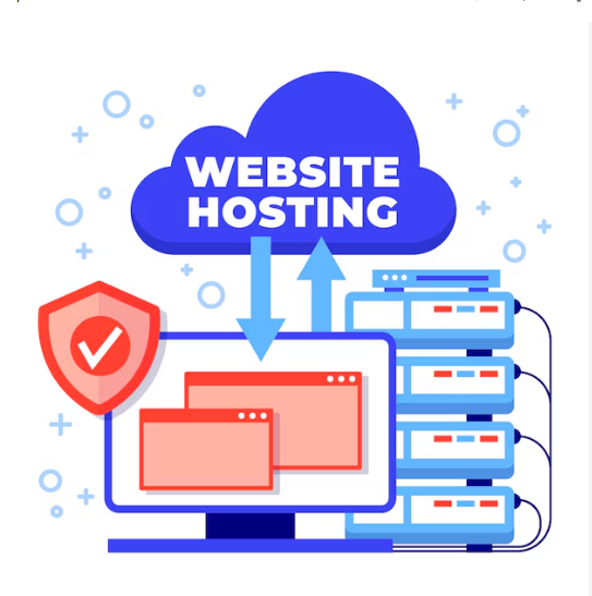
Creating an effective landing page is crucial for converting visitors into customers, and understanding the underlying factors that contribute to its success is essential. One important aspect to consider is website hosting, as it can significantly impact your site’s performance and user experience. For a deeper insight into how hosting affects your online presence, you can read this informative article on the importance of website hosting. By ensuring your landing page is hosted on a reliable platform, you can enhance loading speeds and improve overall functionality, ultimately leading to better conversion rates.
How will it improve their quality of life? Be clear & succinct: Get right to the point. Don’t use ambiguity or jargon. Make use of powerful, action-oriented language: Words that arouse feelings or motivate people to take action can be very powerful. Try a variety of headlines: What appeals to you may not appeal to your target audience. Here, A/B testing works to your advantage.
Creating an effective landing page is crucial for capturing the attention of potential customers and driving conversions. To enhance your understanding of this topic, you might find it helpful to explore a related article that delves into the importance of first impressions in online marketing. This insightful piece discusses how the initial interaction with your audience can significantly impact their perception of your brand. For more information, check out this article on mastering the first impression.
Extend the Promise in the subheadline. The subheadline encourages the reader to continue reading by adding a little more information and reiterating the main point of your headline. Describe the main advantage in more detail by providing some background information or a particular result. Deal with a major source of pain by demonstrating that you are aware of their issue and have a solution.
Body Copy: Depicting the Value. Now is the time to present your case. You must describe what you have to offer, why it is worthwhile, and why they should take immediate action. Emphasize advantages rather than just features: Rather than stating, “Our software has X feature,” state, “Our software helps you save 10 hours a week by automating Y task.”. The “. For scannability, use bullet points to break down important features and advantages into lists that are simple to understand.
Instead of reading web pages word for word on their first visit, people scan them. Handle possible objections: Consider what might prevent someone from converting and take proactive measures to address those worries. Keep paragraphs brief: On the internet, lengthy text passages can be intimidating.
Aim for two to three sentences in each paragraph. Visuals Have Power: They’re Not Just Beautiful Pictures. Visuals have a big influence on how people view a landing page and how well it converts.
They can illustrate your offer, express emotion, and break up text. High-quality pictures and videos. Your visuals should support your message, be professional, & be pertinent. Show, don’t just tell: Use crisp, eye-catching images of a product in use if you’re trying to sell it. If it’s a service, think about showcasing satisfied customers or the outcomes of your efforts. Video can be a game-changer: A brief, captivating video can greatly increase engagement, establish trust, & clarify complicated offers.
Steer clear of stock photos that appear to be stock photos because generic imagery can detract from the authenticity of your page. Layout and Design: Directing the Eye. A visitor’s attention is directed by the layout of your page.
People will leave a cluttered or confusing design. Avoid packing too much information on a single page by using white space. A lot of white space improves the readability and professionalism of the content. Use font sizes, weights, & colors to direct the visitor’s eye through the most crucial information first. Visual hierarchy is important. Mobile-first design: Assume that mobile devices will be used by the majority of your visitors.
Make sure your layout works well and is responsive across all screen sizes. Telling them what to do next is known as the call to action. The time of truth is now.
Your Call to Action (CTA) button must be obvious, captivating, and hard to overlook. Creating a CTA That Works. More than just a button, the call to action (CTA) serves as the entry point for conversion. Make it stand out by using a color that contrasts sharply with the rest of your page.
Use text that is action-oriented. For example, instead of “Submit,” consider “Get Your Free Guide Now,” “Start Your Trial Today,” or “Download Instantly.”. The “. Be specific: What will happen when they click should be made very clear in the CTA text. Placement is crucial: If it’s a longer scroll, your call to action should be repeated further down the page & frequently above the fold. Think about button size: It must be big enough to be tapped with ease on mobile devices.
Microcopy: Big Impact, Small Words. Small textual elements that direct users, such as button labels, error messages, or form field instructions, are referred to as microcopy. Reinforce value: Brief statements like “No credit card required” or “Instant access” can provide an additional push close to the call to action. The “. Minimize friction: Forms with clear instructions can help avoid misunderstandings and abandonment. Establishing Credibility & Trust: Why Should They Trust You?
If people believe in you and your offer, they are more likely to convert. You must prove your legitimacy and the fulfillment of your offer. Social Proof: Other People’s Power. When making decisions, the opinions of others have a significant impact. Testimonials and reviews: Sincere endorsements from pleased clients have significant influence.
If at all possible, include names or pictures. Case studies: Extensive illustrations of how your product or service has assisted others in achieving outstanding outcomes. Trust badges: Reputable partners’ logos, honors, or security seals can increase trustworthiness.
Number of users/clients: It can be highly beneficial to highlight your large user base. Assurances and guarantees. For conversions to occur, perceived risk must be decreased. Money-back guarantees: If applicable, a solid guarantee can eliminate a significant deterrent to buying.
Privacy statements: Reassure visitors that their data is secure & won’t be exploited. Clearly stated contact information: It fosters confidence when people can easily get in touch with you if they have any questions. The never-ending journey of optimization and testing. It is not possible to “set it and forget it” when creating a landing page. The best way to get the most conversions out of it is to keep testing.
Split testing (A/B testing). This is your go-to tool for figuring out what actually appeals to your audience. Almost anything can be tested, including headlines, CTAs, images, form lengths, copy variations, and offers. To determine what is actually having an impact, test one component at a time. Track outcomes with analytics: Keep a careful eye on conversion rates.
Mobile-friendly design. We’ve said it before, but it’s worth saying again. The conversion rates for mobile and desktop devices can differ significantly. Mobile users are impatient, so speed is crucial. Visitors will abandon a page that loads slowly. Optimize code and images for speed.
Simple navigation: Links and buttons should be big enough to be tapped. Simplified forms: On mobile devices, only request necessary information. Analytics and monitoring.
If you don’t measure, you can’t improve. Important metrics to monitor include time on page, conversion rate, bounce rate, & traffic sources. Heatmaps and session recordings: You can identify areas of friction by seeing how users interact with your page using tools like Hotjar. You can go beyond simply having a landing page and create a high-converting machine that works for you by concentrating on these essential components. It involves comprehending your audience, communicating effectively, establishing credibility, & continuously improving your strategy.
.
FAQs
What is a landing page?
A landing page is a standalone web page created specifically for a marketing or advertising campaign. It is where a visitor “lands” after clicking on a link in an email, social media ad, search engine result, or similar places.
What is the purpose of a landing page?
The main purpose of a landing page is to convert visitors into leads or customers. It typically contains a form that collects visitor information in exchange for a valuable offer, such as a free trial, ebook, or webinar.
What are the key elements of a landing page?
Key elements of a landing page include a compelling headline, a clear and concise value proposition, a visually appealing design, a call-to-action (CTA) button, and a form for capturing visitor information.
How can a landing page be optimized for better performance?
A landing page can be optimized for better performance by conducting A/B testing on different elements such as headlines, images, and CTAs, ensuring fast loading times, and making the page mobile-responsive.
What are some best practices for creating an effective landing page?
Some best practices for creating an effective landing page include keeping the design simple and uncluttered, using persuasive and benefit-focused copy, providing social proof, and ensuring a seamless user experience from click to conversion.