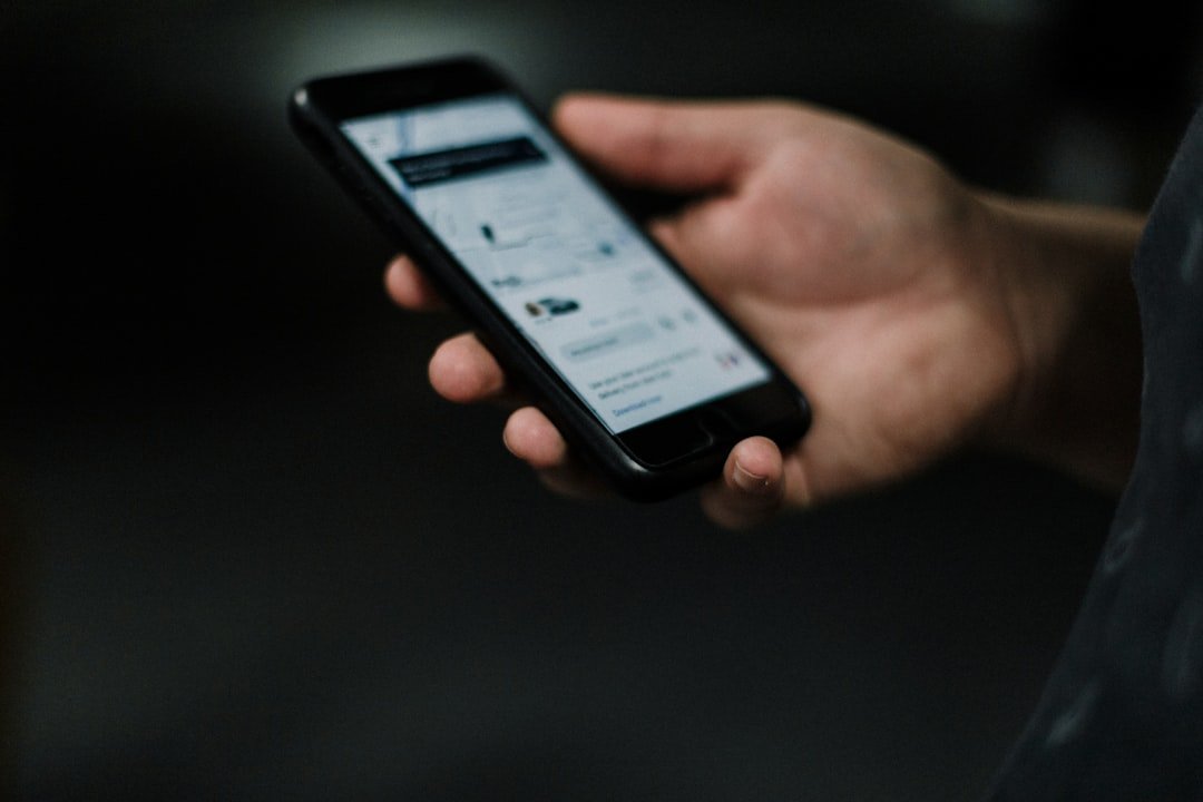
Let’s talk about mobile-friendly booking. In today’s world, if your booking process isn’t easy and smooth on a phone, you’re likely missing out on a lot of potential customers. It’s not just a nice-to-have anymore; it’s pretty much essential for keeping your business competitive.
Think about your own phone habits. How often do you pull it out to look something up, compare prices, or even make a purchase? Chances are, it’s a lot. The reality is, most people are browsing and booking on their mobile devices. This isn’t a trend that’s going away; it’s the norm.
Your Customers are Always on Their Phones
It’s almost a cliché to say everyone has a smartphone, but it’s true. People carry them everywhere, and they’re often the first thing they reach for when they have a spare moment or a need. This means they might be looking for your services while on their commute, during a lunch break, or even while out with friends. If your booking isn’t readily available on their screen, they’ll likely find someone who is.
The Rise of “Micro-Moments”
Google coined the term “micro-moments” to describe these fleeting instances when people turn to their devices to act on a need. These needs can be to learn something, do something, discover something, or buy something. For your business, this translates to someone suddenly realizing they need a hotel room, want to book a dinner reservation, or decide it’s time for that haircut. If your booking system isn’t instantly accessible and user-friendly on their phone during these critical moments, that potential customer can easily slip away to a competitor.
Devices are Becoming Primary for Many
For a significant portion of the population, their smartphone is their primary internet-connected device. They might not own a laptop or a desktop computer, or they simply prefer the convenience of their phone. This means your website and booking system need to be designed with these users in mind, ensuring they have a complete and satisfying experience without ever needing to switch to a larger screen.
In today’s digital age, having a mobile-friendly booking system is crucial for businesses looking to enhance customer experience and drive sales. A related article that delves into the importance of affordable hosting solutions for small businesses can be found at Affordable Shared Hosting Plans for Small Businesses. This resource highlights how reliable hosting can support your mobile-friendly initiatives, ensuring that your booking platform runs smoothly and efficiently, ultimately benefiting your business growth.
The Frustration Factor: Why Clunky Mobile Booking Fails
We’ve all been there. You’re trying to book something on your phone, and the website is a nightmare. Buttons are too small, text is tiny, and you’re constantly zooming in and out, trying to tap the right thing. It’s infuriating, and it’s a surefire way to lose a customer.
The “Shrink and Spit” Problem
This is where a website designed for desktop is simply shrunk down to fit a mobile screen without any real adaptation. It’s like taking a large poster and trying to cram it into a small envelope – everything gets squished, illegible, and impossible to navigate. Users have to pinch and zoom constantly, making the process tedious and frustrating.
Tiny Buttons and Unresponsive Forms
Imagine trying to tap a button that’s the size of a pinhead. Or trying to fill out a form where the fields are cramped and the keyboard keeps popping up and covering half the screen. These small design flaws, which might not even be noticeable on a desktop, become massive barriers to entry on mobile. Users will abandon the booking process out of sheer annoyance.
Slow Loading Times Kill Conversions
Mobile users are often on the go and have less patience for slow websites. If your booking page takes too long to load, especially on a mobile network, people will give up. They’ll assume your business is either outdated or unreliable, and they’ll move on to a competitor with a faster, more responsive site.
The Conversion Connection: How Mobile-Friendly Booking Boosts Sales
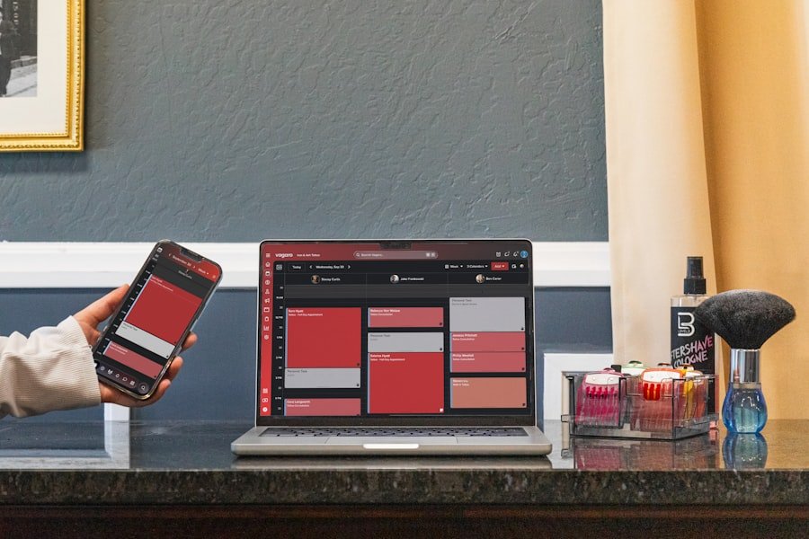
It’s not just about avoiding frustration; it’s about actively making it easier for people to buy from you. A seamless mobile booking experience directly impacts your bottom line.
Increased Booking Rates
When booking is simple and intuitive on mobile, more people will actually complete the process. They don’t get lost, frustrated, or give up halfway through. This directly translates to more reservations, more appointments, and more sales for your business. It’s a straightforward cause and effect.
Higher Average Order Value
Interestingly, studies have shown that mobile-friendly experiences can sometimes lead to a higher average order value. When customers can easily browse and select add-ons or upgrades on their mobile device without friction, they might be more inclined to spend a little extra. The ease of the process removes a barrier to impulse decisions or considered additions.
Reduced Cart Abandonment
Cart abandonment is a killer for online businesses. On mobile, this is often exacerbated by poor user experience. If your checkout process is clunky or confusing on a phone, customers are more likely to leave items in their cart and never return. A mobile-optimized checkout streamlines the payment process, reducing the chances of them changing their mind.
Sure, here is the sentence with the clickable link:
I highly recommend using a WordPress Booking Plugin for your website.
Beyond Booking: The Ripple Effect on Your Brand

Your mobile booking experience isn’t an isolated event; it’s a reflection of your entire brand. A poor mobile experience can tarnish your reputation, while a great one can enhance it.
Building Trust and Credibility
A well-designed, mobile-friendly website signals professionalism and attention to detail. It tells potential customers that you understand their needs and are invested in providing them with a positive experience. This builds trust and makes them more likely to choose you over a competitor. Conversely, a poorly optimized site can make your business look amateurish and untrustworthy.
Enhancing Customer Loyalty
When customers have a consistently positive experience booking with you, especially on their preferred device, they are more likely to return. This fosters loyalty and turns one-time bookers into repeat customers. They know they can rely on you for a hassle-free process, which is a valuable commodity.
Positive Word-of-Mouth and Reviews
Happy customers are more likely to share their positive experiences. If someone has an incredibly easy and pleasant time booking your services on their phone, they might tell friends, family, or even leave a glowing online review. Conversely, a frustrating mobile booking experience can lead to negative reviews and word-of-mouth, which can be very damaging.
In today’s digital landscape, ensuring that your booking system is mobile-friendly is essential for attracting and retaining customers. A related article discusses the latest trends and success strategies for hosting, which can provide valuable insights into optimizing your online presence. By understanding these trends, you can enhance your business’s mobile experience and stay competitive in the market. For more information, you can read the article here.
Practical Steps to Mobile-Friendly Booking
So, how do you actually make sure your booking process is mobile-friendly? It’s not as complicated as it might sound, and there are several practical steps you can take.
Responsive Design is Key
The most crucial element is responsive web design. This means your website automatically adjusts its layout and content to fit the screen size of whatever device is being used – be it a desktop, tablet, or smartphone. It ensures that your content is always readable, navigable, and visually appealing, regardless of the screen.
How to Check for Responsiveness
- Test on Different Devices: The most straightforward way is to view your website on various smartphones and tablets yourself. Pay attention to how text appears, how buttons are spaced, and how easy it is to navigate.
- Use Online Tools: There are many free online tools that allow you to simulate how your website looks on different devices. Simply enter your website’s URL, and these tools will generate previews.
- Browser Developer Tools: Most web browsers have built-in developer tools that can simulate mobile devices. This is a more technical approach but provides accurate insights.
Simplify Your Booking Flow
Think about the absolute minimum number of steps a customer needs to take to book with you. Every extra click or piece of information requested is a potential point of friction.
Streamlining the Process
- Minimize Form Fields: Only ask for essential information. Do you really need their middle name for a simple appointment? Collect only what’s necessary to confirm and deliver the service.
- Guest Checkout Options: If you sell products or services that don’t require an account, offer a guest checkout option. Forcing users to create an account can be a significant deterrent on mobile.
- Clear Calls to Action: Make your “Book Now,” “Reserve,” or “Add to Cart” buttons prominent and easy to tap. Use contrasting colors and sufficient spacing.
Optimize for Speed and Performance
As mentioned earlier, speed is critical. A slow-loading website is a leaky bucket.
Boosting Your Site’s Speed
- Image Optimization: Large, uncompressed images are a primary culprit for slow loading times. Use tools to compress your images without sacrificing quality.
- Minimize Code: Unnecessary code can bog down your website. Work with your developer to ensure your code is clean and efficient.
- Leverage Browser Caching: This allows returning visitors’ browsers to store parts of your website, so it loads faster on subsequent visits.
- Consider a Content Delivery Network (CDN): A CDN stores copies of your website on servers in different geographical locations, delivering content from the server closest to the user, thus reducing load times.
Mobile-First Design Principles
Instead of designing for desktop and then adapting for mobile, consider adopting a “mobile-first” approach. This means designing your website and booking process with the smallest screens in mind first, and then scaling up for larger screens.
The Mobile-First Mindset
- Prioritize Core Functionality: What is the absolute most important action you want users to take? Ensure that this is front and center and easily accessible on mobile.
- Thumb-Friendly Navigation: Design menus and buttons that are easy to tap with a thumb. Large enough tap targets and adequate spacing are crucial.
- Concise Content: Mobile users tend to skim. Break up large blocks of text with headings, bullet points, and shorter paragraphs.
Integrate with Popular Mobile Payment Options
Making payment as effortless as possible is the final hurdle.
Frictionless Payments
- Apple Pay and Google Pay: Integrating these options allows customers to pay with a single tap or facial recognition, bypassing the need to enter card details.
- Clear Payment Information: Ensure that payment details are displayed clearly and securely. Customers need to feel confident that their financial information is safe.
- Confirmation Screens: After a successful booking and payment, provide a clear confirmation screen and send a follow-up email or text. This reassures the customer that everything is complete.
By focusing on these practical steps, you can transform your booking process from a potential headache into a seamless, positive experience that drives more business your way. It’s about meeting your customers where they are, and increasingly, they are on their phones.
FAQs
1. What is mobile-friendly booking?
Mobile-friendly booking refers to the ability for customers to easily and efficiently book services or make purchases using their mobile devices, such as smartphones or tablets. This includes having a website or app that is optimized for mobile use, with easy navigation, clear call-to-action buttons, and a seamless booking process.
2. Why is mobile-friendly booking important for businesses?
Mobile-friendly booking is important for businesses because a large percentage of consumers now use their mobile devices to research and make purchases. By providing a mobile-friendly booking experience, businesses can cater to the needs and preferences of their customers, increase their reach, and ultimately drive more bookings and sales.
3. How does mobile-friendly booking impact customer experience?
Mobile-friendly booking can greatly enhance the customer experience by making it easier and more convenient for customers to book services or make purchases. It allows customers to book on the go, at any time, and from any location, leading to a more seamless and satisfying experience.
4. What are the benefits of implementing mobile-friendly booking for businesses?
The benefits of implementing mobile-friendly booking for businesses include increased customer satisfaction, higher conversion rates, improved accessibility, and the ability to stay competitive in a mobile-driven market. It also allows businesses to capture potential bookings from customers who primarily use mobile devices for their online activities.
5. How can businesses ensure their booking process is mobile-friendly?
Businesses can ensure their booking process is mobile-friendly by optimizing their website for mobile use, implementing a responsive design, simplifying the booking process, and testing the booking experience across various mobile devices. It’s also important to provide clear and concise information, minimize load times, and offer secure payment options for mobile users.